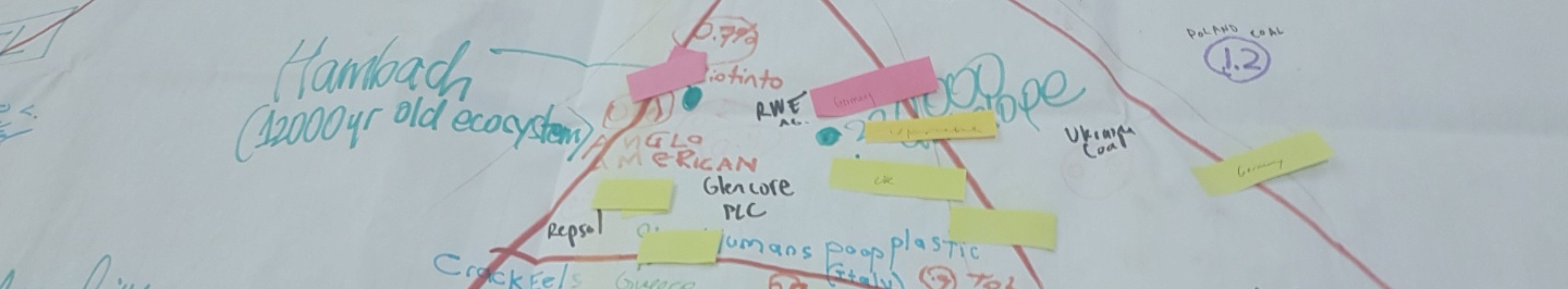
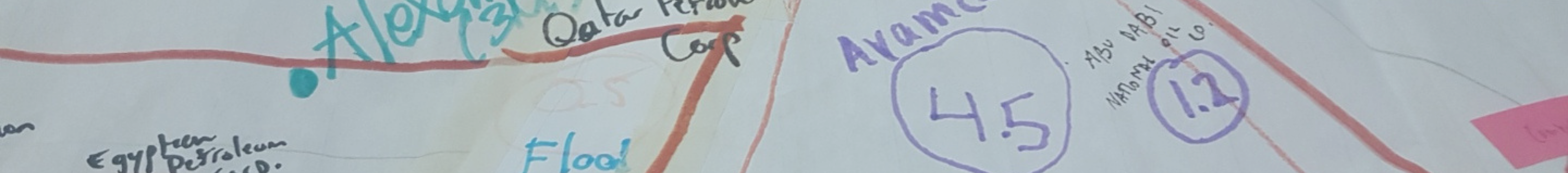
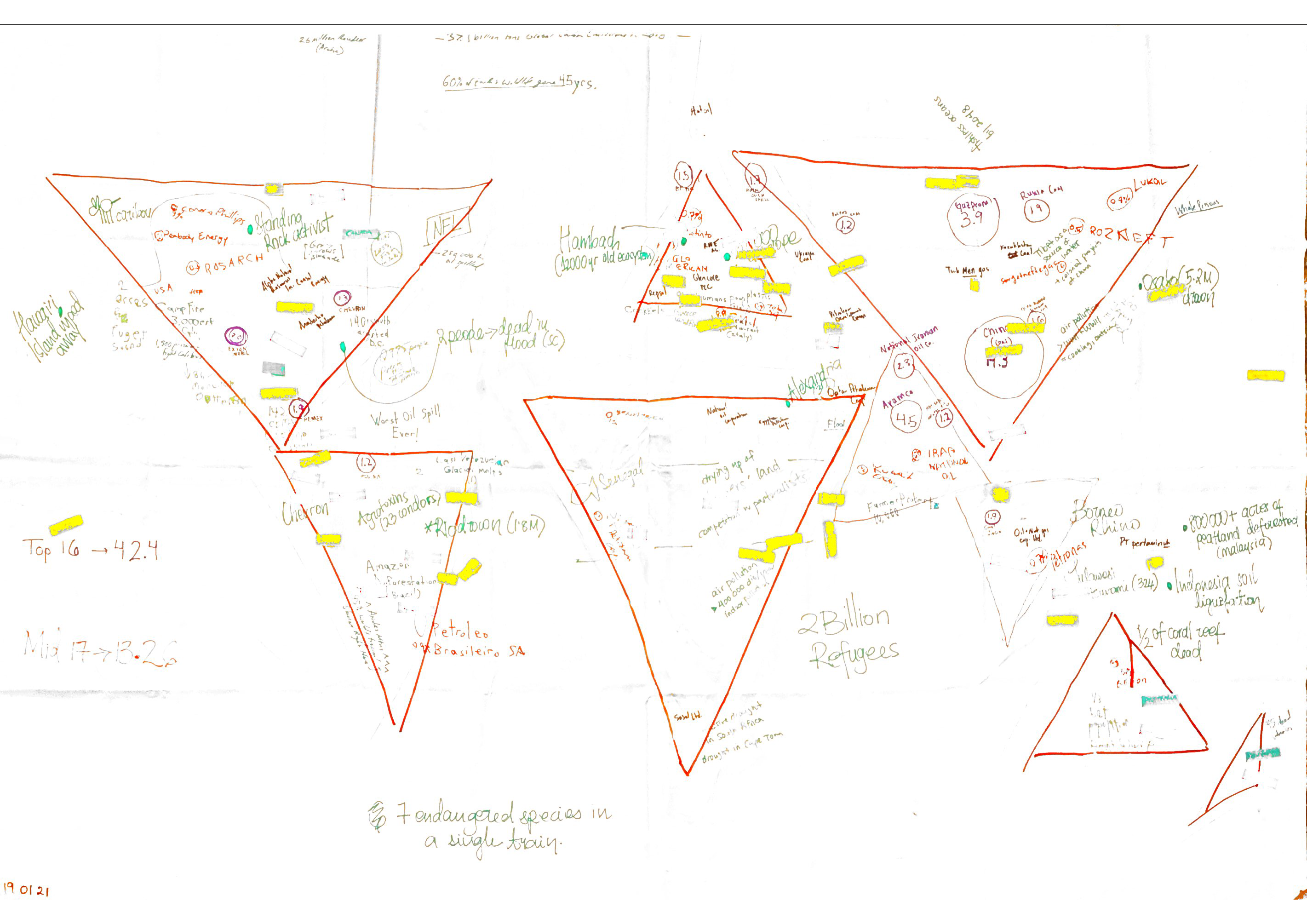
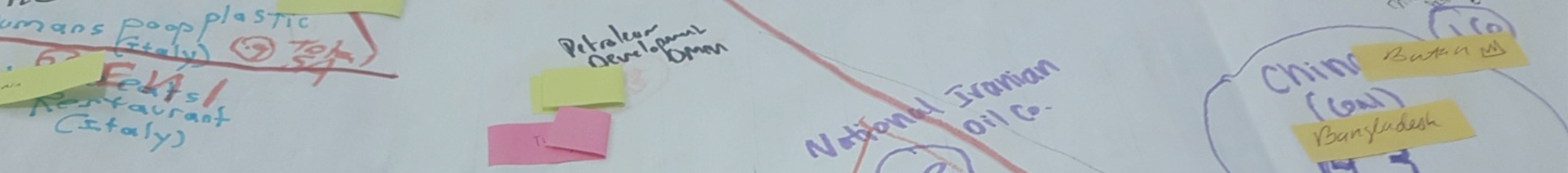
Participants were presented with prominent recent news articles and social media postings about climate change impacts, along with the addresses of the 100 corporations responsible for the most GHG emissions globally since 1988. Together, participants mapped out climate emissions and impacts, discussing links with geographies of race.
Why a climate map?
Power mapping of state and corporate industrial emitters
Tracking reports of climate impacts in news coverage and social media
Comparing and contrasting geographies of emissions and climate impacts
These data were compiled into a single spreadsheet and placed on a highly stylized world map. Below is the physical map created by Conversations participants, followed by a digital version created on Google Maps.
Physical climate map
The map below was created by participants of <i<Conversations on a highly stylized world map. The Additions to the climate map were made throughout the seminar as participants incorporated the map into their own facilitated sessions.
Digital climate map
This is a digital version of the climate map pictured above. Climate impacts are shown in blue and corporate emitters are shown in red, with the darkness of the red colour corresponding to the amount of emissions (GtCO2e) released by the corporation from 1750-2010.